Nicola Frachesen

About Me

Portfolio

Resume

Contact
About Me
Hello all! My name is Nicola Frachesen and I'm a UX designer, writer, and programmer with a focus on accessibility and communication. Thus, I hope to make technology and other services impactful and inviting to those who need it most. I recently wrapped up contract work as a Data & Canvass Director for local nonprofit SAVE LGBTQ, and continue to act as a Project Manager on the SAVE History Project, which chronicles the history of LGBTQ rights in Florida.

On a more personal note, I enjoy reading, hiking, video games, unusual foods, and being intensely curious about pretty much everything.
Portfolio
  The throughline of my user experience design work has been accessibility, ensuring that people, groups, and industries out of reach of the current tech landscape can be empowered and connected. Below, you will find that Trust Your Vote, OvenReady, and Donator include traditional case studies showcasing my design process, while VIBES and Dying Dreams hold deeper dives on designing for young students and the blind, respectively.
Trust Your Vote
A personal project to design a website and mobile app that allows voters to easily find local organizations that make political endorsements. Trust Your Vote empowers people to vote in lesser-known, down-ballot, and nonpartisan elections.
OvenReady
OvenReady is a personal project in which I designed software that helps small bakeries stay organized and focused on doing what they love. It addresses needs of these small businesses in ways largely unmet in the current market.
VIBES
VIBES is a software project aimed at providing personalized assistance to middle school-aged students in developing their emotional well-being and interpersonal skills, and to empower educators to help them in that process. As the developer of the project's MVP, I laid the foundation for its UX, design language, and interactive scenarios.
Dying Dreams
My personal senior project, Dying Dreams is a video game with no video; a completely audio-based role-playing game designed to be inclusive of the visually impaired and engaging for all. It was made using Unity and 3D audio technology, and is fully voiced.
Donator
Group project from a university UX Design course made for a client from the Royal Bank of Canada. Following research, interviews, and generating personas and user flows, we wireframed and prototyped an app for donating to those in need, primarily using Invision.
Programming
In addition to its own requirements, my Human-Computer Interaction degree included all the core coursework of a computer science major. Here are a few examples of GitHub projects in full stack web development, Java, and C#. As such, I am familiar with the full agile development pipeline, know how to code, and can comfortably communicate with engineers.
Writing & Speaking
My varied experiences in professional and creative writing include stories, interactive narratives, UX writing, and trainings. A sample of my fiction can be found here, while an example of my technical work can be found here. Additionally, my public speaking experience includes recognition at the high school Harvard Model Congress, and hosting presidential campaign events on LGBTQ+ issues during the 2020 election cycle.
Resume
Download
Contact


тои
Trust Your Vote
The Problem
  Voters often arrive at their polling places knowing about high-profile races, whereas local and nonpartisan ones go under the radar. This is despite the fact that a plethora of local organizations - such as civil rights groups, newspapers, and unions - make endorsements in such races.

The Solution
  A website and mobile app allowing voters to easily find local organizations that make political endorsements they can trust, thus informing and empowering them to vote in lesser-known elections.
Project Overview
  As a personal, proof-of-concept project, I performed all user research and design work, along with prototyping the project in Figma.
  Initially conceptualized as a way to help people vote in local elections, I soon realized the important role organizations play in informing voters.

Competitive Audit
  First I had to understand where current products were falling short in bridging the gap between voter turnout for national and local elections - even when races are on the same ballot. I found that current sources rarely included endorsements, which can be a deciding factor in local and nonpartisan elections. Meanwhile, the local organizations that make these recommendations are often hard to find online, their endorsements scattered.
Interviews
  Speaking with voters cemented the importance of local organizations and their endorsements. Those who did not vote did so both because they had not heard of the candidates, and did not know where they could find concise, trustworthy recommendations. Lacking endorsements, most found it took unreasonably long to do their own research.
  Having experience working with nonprofits, I contacted local leaders. They were sympathetic to voters' difficulties, but also outlined challenges in advertising their endorsements. Being able to efficiently find others' recommendations would also help them save time in research and decision making.

Personas
  Information in hand, I created two personas to broadly exemplify my userbase: one of them an expert wanting to keep tabs on politicians, the other an average person frustrated with voting in local elections.
Wireframes & Low-Fidelity Prototypes
  After sketching out various ideas on paper, I created several sets of wireframes in Figma: one for a mobile app, and three for a responsive website at typical phone, tablet, and desktop sizes. All included the full set of features needed for a final product, and allowed me to create a low-fidelity prototype to begin user testing.

These lo-fi prototypes are available at the following links:
Mobile App
Mobile Website
Tablet Website
Desktop Website
Usability Study
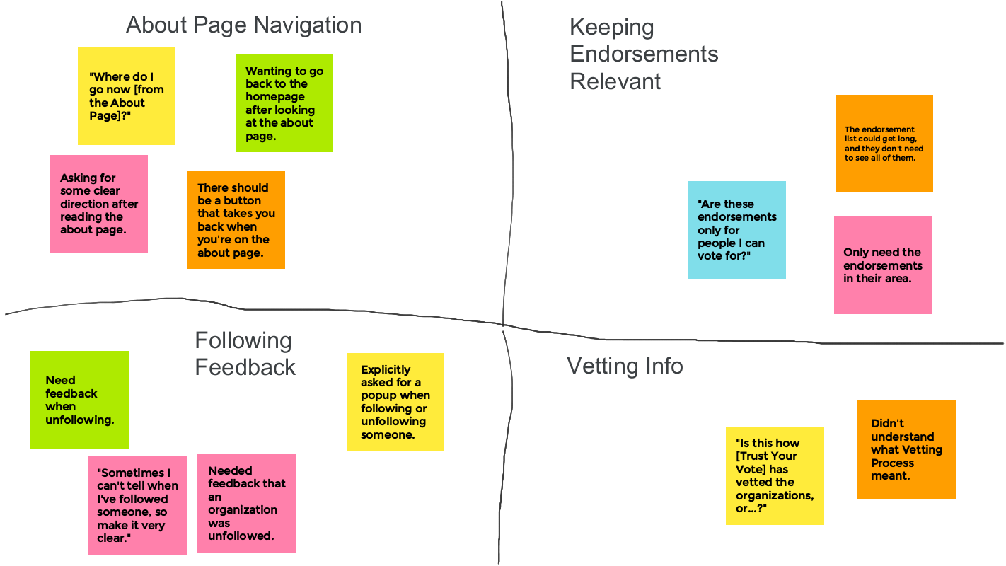
  Using primarily the mobile app prototype, I then conducted moderated user testing, asking 5 people to perform core tasks and describe their thoughts aloud. Reactions were largely positive regarding its feature set and interaction design, but I received constructive criticism to improve feedback, clarify jargon, and improve navigation, as demonstrated in this affinity diagram.
Mockups & High-Fidelity Prototypes
  Applying the findings from my study, I set about turning my wireframes into development-ready mockups. Design language was devloped to be consistent between each medium, with changes being based on screen size and target users; for instance, professionals would be more likely to use the app, whereas average voters might simply check the website on election day. These mockups were then turned into a series of high-fidelity prototypes representing the look and feel of a finished product.

These hi-fi prototypes are available at the following links:
Mobile App
Mobile Website
Tablet Website
Desktop Website
Takeaways
So many people want to be engaged in the civic process, but it can be hard to find the time to vote, much less finding time to research a long slate of candidates. By connecting people with organizations that make political endorsements - whether they be a newspaper, nonprofit, or other group - voters can be empowered to have a much greater voice. As such, there is a major need for something like Trust Your Vote, and I will continue to research the feasibility of bringing such a product to market.

OvenReady
The Problem
  No product currently on the market caters to the unique organizational needs of independent local bakeries, whose employees need to juggle a wide array of tasks in addition to baking.

The Solution
  A mobile app and accompanying website that allows bakers to keep their data and tasks organized. OvenReady is a one-stop shop to store recipes, inventories, and schedules, allowing bakers to stay focused on doing what they love.
Project Overview
  A personal design project in which I performed all user research and design work, eventually prototyping it using Figma and Adobe XD.
  Though I had originally planned on only designing a mobile app, I later decided to conceptualize a website designed for other platforms. This was done to meet bakers' expectations: allowing them to access these tools both in hectic work situations, and when they could sit down to plan further.

Competitive Audit
  Though a variety of tools exist for both hobbyists and larger corporations, none of these products meet all the needs of local bakeries, where a small group of people both bake and keep their business organized. Using multiple, separate tools - as is the case for many small bakers now - comes with added complexity and lack of synchronization.
Interviews
  In order to gain a meaningful understanding of my users, I began by interviewing someone with experience working at small bakeries. They walked me through a typical day, as well as some major pain points: confirming the need for recipe ideation and scheduling as major features, and introducing me to issues regarding inventory management and the nonlinear scaling of recipes. Less in-depth interviews with small business owners then rounded out my understanding of their general needs.

Personas
  Using this research, I created two personas: one a bakery owner trying to manage his business, and the other an employee at such a bakery.
Mobile Wireframes & Low-Fidelity Prototype
  After brainstorming a number of different concepts, I landed on an old-fashioned, recipe book-like design for the app, which would hopefully allow it to be fun and familiar for new users. This concept was then expanded into a series of wireframes and a low-fidelity prototype made in Figma:
Mobile App Lo-Fi Prototype

Usability Study
  Using this prototype, I conducted a moderated usability study including the baker I interviewed and several other participants. Given the wide variety of features needed in the app, I received many helpful notes as the participants walked me through their actions, which were compiled in the affinity diagram to the left.
Mobile Mockups & High-Fidelity Prototype
  Applying the lessons learned from user feedback, I set about improving OvenReady's prototype and increasing its fidelity. This resulted in a polished, high fidelity prototype that allows users to sample the app's full featureset, ranging from storing and scaling recipes, to scheduling and assinging tasks to employees:
Mobile App Hi-Fi Prototype

Expanding Scope
  With the app now designed, I again consulted potential users who indicated the usefulness of a desktop version of OvenReady. Though the app has use on the go or in the middle of a hectic kitchen, taking notes and creating schedules would often be more useful to have on a computer. Thus, I got to work adapting my designs for use on a tablet and desktop-friendly website.
Desktop & Tablet Prototypes
  Instead of using Figma, as I had thus far, I designed the remaining wireframes, mockups, and prototypes in Adobe XD, which was an excellent opportunity to train myself in a new tool. The larger screen sizes additionally allowed me to display much more data to users, especially in scheduling: a task more likely done at home instead of on the go. After receiving approval of the low fidelity prototype from bakers and testers, I upgraded it to high fidelity, rounding out a full suite of production-ready prototypes for multiple devices:
Desktop Lo-Fi Prototype
Tablet Lo-Fi Prototype

Desktop Hi-Fi Prototype
Tablet Hi-Fi Prototype
Takeaways
Diving into the world of local bakeries was such an informative experience, allowing me to learn of the difficulties faced by small businesses and those trying to turn a passion into a profession. So many of the solutions I had to create for OvenReady were novel, making it the sort of challenge I have my own passion for solving. It is my hope that OvenReady can bring attention to meaningfully addressing the challenges faced by this beloved, but neglected, industry.

Designing an MVP for VIBES
or,
How to Harness Latent Curiosity

  I recently had the great fortune of contributing to the VIBES project, which aims to provide personalized assistance to middle school kids (and their adults) to help them grow in emotional maturity and social awareness. Though I worked on many aspects of the project's early stages - including design language, prototype development, and both UX and creative writing - I am not at liberty to disclose most of that information. I can, however, provide a deep dive into a seemingly innocuous aspect of student-side interaction design I focused on for the VIBES Minimum Viable Product.

  Viability, really, was my primary concern in the MVP. I was tasked with developing this in Qualtrics, after all, thus leaving me with a seemingly impossible goal:
How in the world could I engage kids with an online survey?

  Indeed, given the focus on emotional development, the project would not be viable at all if the students taking it were not fully invested in the experience. Though this can partially be remedied through skillful writing as well as research on social and emotional learning, design was a core component. Such a restrictive design challenge as this - engaging students only through the placement of words on a page - is always something I love to tackle.

  To start, I recognized that reading (and by extension, taking a survey) is consciously viewed as requiring effort by students; especially those who do not enjoy literature on their own. Thus, my goal became to minimize as much as possible the conscious work that goes into reading, while maximizing the latent curiosity people experience from novel tasks. In the words on Don Norman, creating work that does not feel like work.

  Here is an example before I go any further. Both images below represent the exact same text: a brief description and some dialogue. The one on the left uses traditional literary standards, whereas the one on the right applies some of the principles I created for this project.

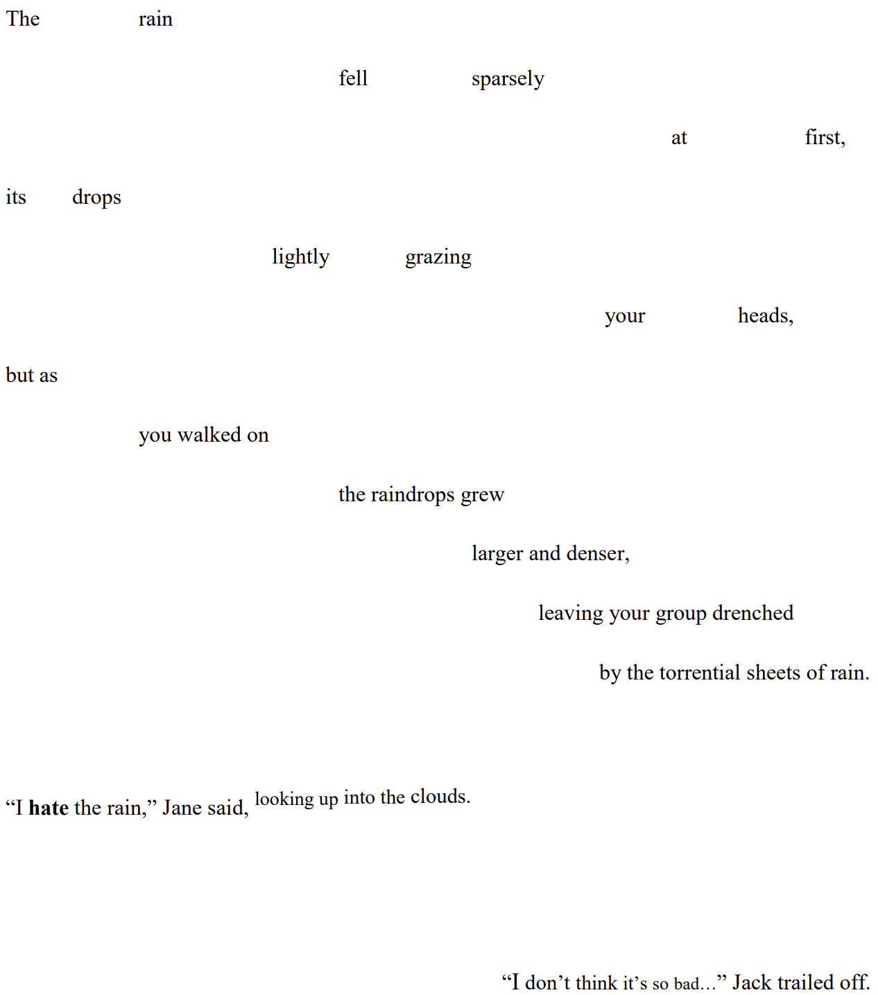
  Looking at these samples with but a cursory glance, the left image appears as writing typically does. It is thus easily dismissed or skimmed over by disinterested students. The right image, on the other hand, requires a more careful degree of consideration, and is not immediately classified in one's mind as typical prose. It is not to the point of being unreadable, of course, but it encourages curiosity, and brings out the inherent human need for pattern recognition. On the left is a pattern kids have seen a million times; one they may have a distaste for. On the right is something new to discover and explore.

  I cannot emphasize enough the value of this first impression. Reminiscing can last a lifetime, but there is only one opportunity to capture that engagement in the first place.

  Next, let us begin actually reading the text. The description of rain going from light to strong is made physical in the right image: the words themselves becoming denser and swifter just as the raindrops do. Such spacing also serves the dual purpose of controlling the pace of reading, just as one would rush more in a downpour than a light drizzle.

  As for the dialogue, giving each of the two characters a different alignment provides an unspoken indication of their locations relative to you in the story. It also makes it much easier for young readers to understand who is speaking in longer exchanges. As for the content of the dialogue, using even simple text effects can add a great deal of personality and presence. Jane's use of bold indicates the emphasis in her words, and the description of her movement physically moves up with her. Meanwhile, having Jack's dialogue become slightly smaller as he goes on provides a physical indicator of him trailing off.

  This careful placement and tweaking of simple words on a page comes with the added benefit of providing those who do not learn well from reading or listening to words - so-called visual or tactile learners - with an additional foothold in the experience, enhancing their understanding of the scenario thanks to greater visual and physical engagement.

  Extending all such principles over the entire course of the product thus keeps students engaged: wondering what other novel ideas will be presented to them and making the actual content of the words that much more likely to have an impact and be remembered long after the experience has completed.

  Returning for a moment to the work of Don Norman, the chart below demonstrates how this design engages all three levels of processing, from one's initial reaction, to their experience of the work, to later refection on its impact. Now, what does all this amount to?
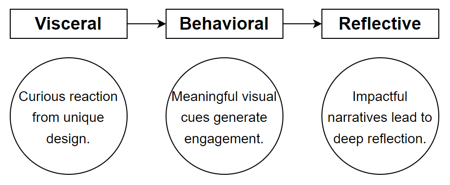
  -The text provides a strong first impression by engaging one's curiosity.
  -It provides far greater pacing and physical presence, making the visual design alone feel interactive.
  -It is more accessible and effective for those who are visual or tactile learners.
  -It keeps kids' interest as to what unexpected surprises could come next.
  -And there is ultimately a much greater, lasting impact from the experience.

  Inspiration and influences for this and other aspects of my work came from sources in both design and literature. Undoubtedly, Don Norman's work on emotional design and levels of processing provided invaluable lenses through which to consider and approach this task. As far as literature goes, stories written in verse such as Long Way Down by Jason Reynolds, and interactive narratives such as Kentucky Route Zero by Cardboard Computer provided great examples of how to experiment with literary design and engagement.

  Though large-scale testing has yet to begin as of this writing, my work - which includes far more than is detailed here - has been put into practice and I have received excellent feedback on it from the experts in design, software development, and education who have led the VIBES project. Given time, I know its positive impact will be felt by many, thanks to the dedication brought to this challenge.
Dying Dreams: Designing Beyond Sight

  When considering the senior project for my Human-Computer Interaction degree, I decided to create a proof-of-concept piece of software for the blind, ultimately settling on a video game: a challenging, restrictive decision given the visual nature of the medium. Though the project's full documentation can be found here, I describe below one of the major issues I contended with when developing the project: conveying needed information to the user concisely.

The Challenges of Auditory Information Sharing

  Below is perhaps the most basic user flow one can make, showing (in broad strokes) how people interact with information a product gives them. A basic user flow depicting a user seeing information, deciding what do, and then performing their desired action.   Critically, most software expects users to visually process information - often a great deal of information - before deciding their next action. Such data even includes subtle visual cues we are not always consciously aware of. Take, for example, the wireframed scene below, which could be a typical moment in any game. A wireframed image of a video game, with several allies and enemies fighting.   Even a cursory glance at this scenario provides a sighted user with a wide variety of information: who enemies and allies are based on color, all characters' positions, characters' names, each character's vitality - and all of this before even introducing the player's options. Yet what is trivial for a sighted user is of no use to a blind one, and I was thus tasked with presenting all this information in a similarly concise way through audio alone.

  The main realization I came to is that, in the same way visual information need not be tediously listed, neither does auditory information. Certain audio cues could be used to allow multiple pieces of information to be presented simultaneously: A chart demonstrating that a character's location can be represented via 3D audio, their vitality through a statement, and which character is currently being discussed by using different voices.   Bringing all of the information in the above chart together: if you hear a voice you recognize as your ally's, to your left, saying that they are slightly hurt, you would have all the same information about this character that would have been given to you visually, provided all at once. Repeat this same process for every other character present, and you have all of the information you need.

  Thus, by using a turn-based method of decision making, I could concisely provide all needed information via audio, and let the user take their time to decide their next move. As such, this program's basic user flow looks pretty different, looping through the necessary information until the user decides their next move, and then starting over again: A new user flow representing this program, which shows how necessary information loops until the player makes their decision.   This was but one of several challenges I faced in creating audio-based software, all of which I thoroughly enjoyed. It is vital that design language and accessibility standards for the blind are further developed, and it was an honor to contribute to that body of work.

Donator: Tech for Those Who Cannot Pay

  For a university user experience design course, I joined a small team tasked with designing, wireframing, and prototyping an application for an external client from the Royal Bank of Canada. Our client requested that this application allow for cashless donations to the homeless, in addition to other charitable causes.

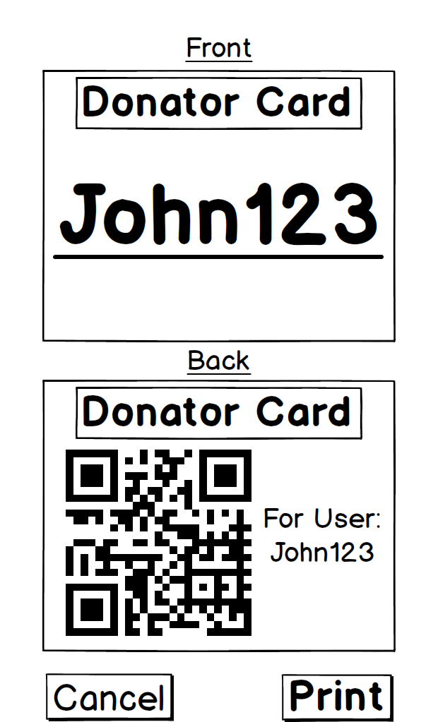
  Tackling this issue required serious considerations of how the homeless population would be able to use any created software without constant access to requisite hardware. To begin, we performed preliminary research on existing applications for cashless transfer of funds and charitable donations. The ensuing brainstorming sessions resulted in the following affinity diagram, including opportunities, breakdowns, and other considerations.   Following this, we performed user research, including interviews I led with professionals in the field of charitable contributions. From that, we developed three personas of typical users of the app, including a homeless person, and a user hoping to donate, someone looking to raise funds for charitable purposes.   With our background knowledge complete, are our target audiences identified, we moved onto ideating how exactly to solve our main issue: ensuring that the homeless could benefit from software they could seldom access. With encouragement from our client, we soon settled on using QR codes as a method of facilitating access. Such codes could be printed by homeless users at libraries or shelters with internet access, and then easily scanned by passers-by wanting to contribute.   Our main interaction now decided upon, we went about defining the primary scenarios of how and why people would use Donator, creating the four storyboards below to map out the features we would need for our prototype.   Finally, we began work on wireframing our project, laying out its interactive and visual design. After several sprints and consulting with our client for feedback, we had created a functional prototype using Invision. Though it can take a moment to load, the full prototype we delivered can be found here. Below is a sample user flow demonstrating a piece of functionality I personally implemented for donating to a homeless individual.   Ultimately, we received positive feedback from our client at RBC, who thanked us for providing novel solutions to issues they faced in cashless payments and serving their less financially privileged clients. Personally, I was thankful to have worked on a project with such competent teammates, one which challenged and grew my design sensibilities, and which allowed me to delve into my passion for inclusive and accessible technology.